
Small details
 Following on from the posts re my entry in a circle journal (see previous posts), I'm just highlighting a couple of features here.
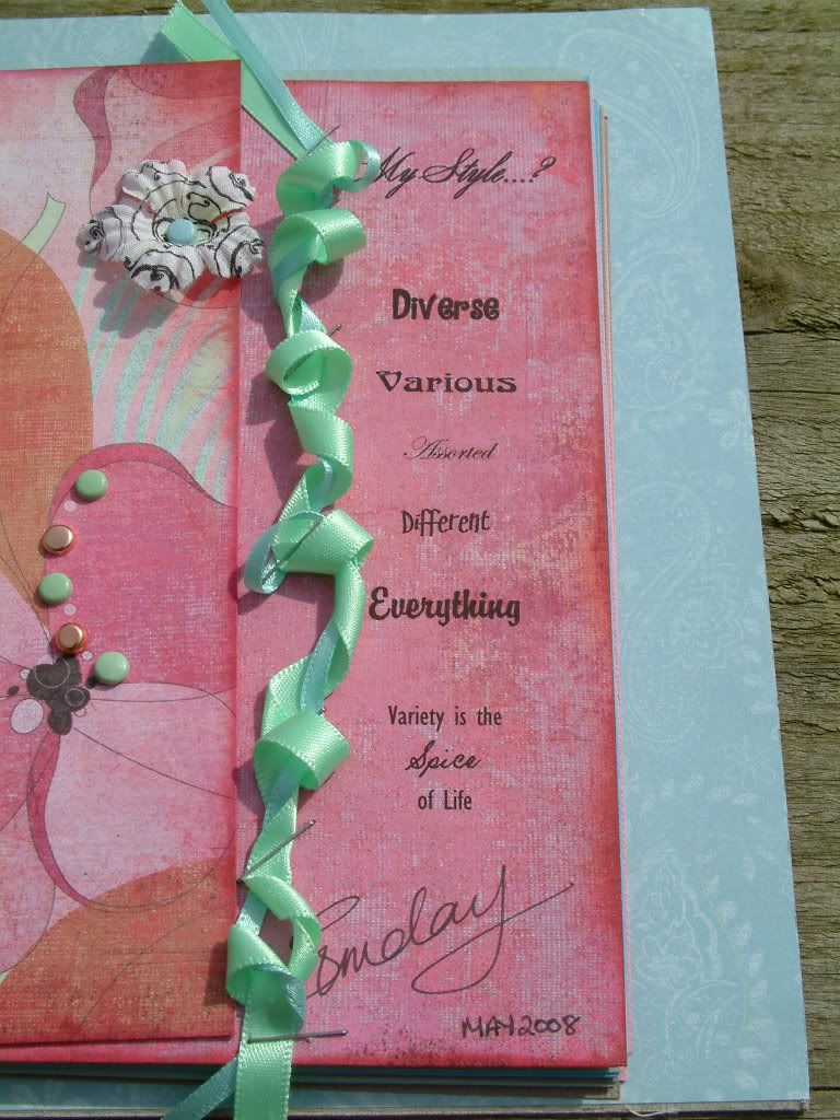
The top picture shows a close up of the printed words on the right hand page.
The hidden journaling under the flap and the words down the side of the page were arranged in "Word" on my computer and then the 6x6" piece of pink Basic Grey Paper (Phoebe collection) was put through my printer. This was done after putting through a test piece of scrap 6x6 first, of course!
Anyway, it's a fairly well used technique to take advantage of all the different fonts out there (on the internet) to add variety to a layout... but here I have deliberately used a different font for each word, to portray the "mixed up" nature of my "style".
The other photograph here shows a flower (which cost one or two pennies as it was a bloom I "disassembled" - or is that "reverse engineered"? LOL), which I have stamped using a "Two Scoops" stamp with StazOn black ink. 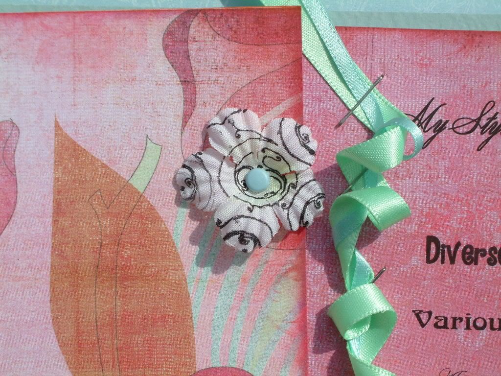
I think the StazOn gives a fine detailing to the stamped image which is not quite so sharp using other, water based, inks.


No comments:
Post a Comment