Thursday, January 31, 2008

Challenge - use up scraps

Ok... today's challenge is to use scraps on your layout.

Now I don't mean just a few - I mean the whole thing, apart from the photos of course, has to be made using your scraps.

The only concession is the background card - 12x12 or 8x8 or whatever size you want to do.

Think you can use ONLY scraps? Think you'll find it harder than it sounds!

And here is a link to a blog with a tip for using those scraps too.

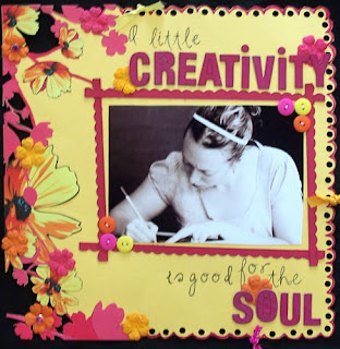
This card was made using scraps, and is made using the "colour blocking" technique... which I will cover in a future post.

Wednesday, January 30, 2008

Scrapbooking Stash Swaps

Are you wondering what one of those is... a scrapbooking stash swap?

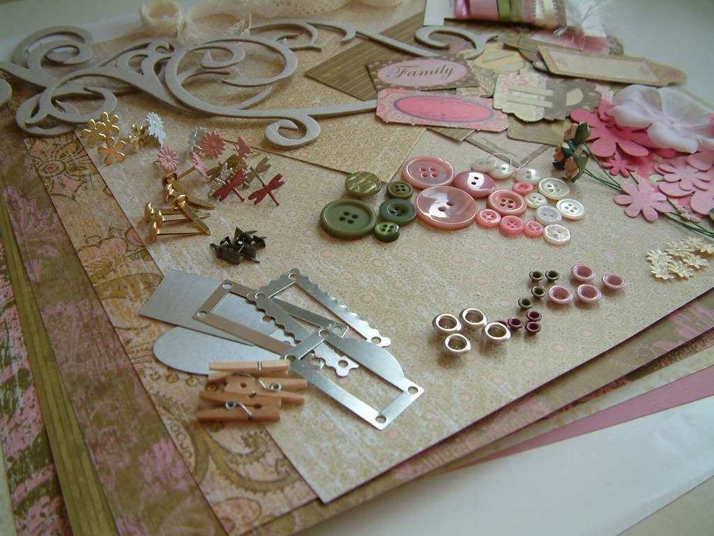
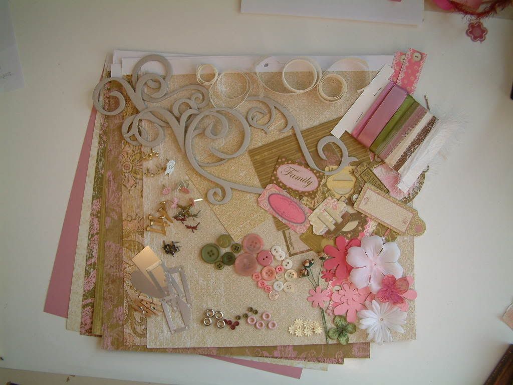
Well I can finally post these pictures of one I prepared for a fellow teamie (spelling?) in my Group on UKScrappers, because she has received it now!

We decided to "do a swap" and so each person on the list posts a package to the name below hers, that way we each get a package.

The amount and what type of stuff (or stash) is dependent on each different swap, but for ours it was a "Spring/Summer" theme and enough stash to make at least one 12x12" layout, not exceeding £5-6 in cost.


Well I think there are a few layouts to be made with this package maybe, but you have to give the recipient some different choices don't you!

Not sure of the actual cost either, but it's all relative. The idea of a swap is that you "swap" (dah!!!) some of what you already have for somebody else's and (hopefully) they will give you something you wouldn't normally buy and therefore you can have fun crafting pages "out of your comfort" zone.

Anyway, the papers and tags, etc are from a K&Co "Scrap Pad to Go" Peabody. The embellishments are from all sorts of sources, the other obvious item in the pictures here are the chipboard swirls and they are by Maya Road.

I actually really enjoyed putting this "kit" together. It was all about the colours and textures and I didn't have to worry about matching in any specific photos! Now I know how much fun all those "Kit Companies" have when they are putting together kits for their subscribers!!

Tuesday, January 29, 2008

Sketches for the masses

This is a sketch from the January collection of sketches at pagemaps.com.

I particularly like this site's sketches, because they are clear, there is an example layout with each one and you can download a pdf file of each months layout sketches p- and you can do it all for free!

We like free... don't we?!

Anyway... another reason why I particularly like this site is because the sketches are usually for more than one photograph, which a lot of "sketches" sites are not geared up to. The other sites are specialising more in the design of the page and (I think) often focusing on art for art's sake rather than the scrapbooking of photographs.

Let's face it we have loads and want to use loads! So here here for Pagemaps.com. It hits the mark when it comes to inspiring scrapbookers to use more photos per page!

Monday, January 28, 2008

Funky Birthday Card

This is a card I made a while ago now... however I thought I would post it here because it is a good use of recycled items in one way or another.

It was for a girl's 17th birthday, so I thought the jeans and bling would do well.

The jeans are cut out from my (then) 3 year old daughter's old pair of jeans. The pocket being utilised as a pocket for a tag.

The Bling... a bracelet I had bought and I used brads to fix it to the jeans. I did leave the bracelet whole, so that it could be taken off the card and worn if she liked it.

The paper was a photocopy of a paper bag received when I bought some books!

So actually the only specifically "scrapbooking" item on this card are the 2 brads!

So a great idea for a budget card!

Sunday, January 27, 2008

Horse Riding - her first lesson

Well, you just know I have got to scrapbook these photos!

Yes, my daughter having her first riding lesson. Not the first time she has been on a horse by any means. In fact she and I made a paperbag book about her first proper ride on a pony of suitable size for her ... called frosty.

Coindentally her first "paid for" lesson was on a white pony too... this time called "Smartie" - short for Smartie Pants, we were informed!!

Thankfully, Smartie was a quiet little pony and the young girl leading him was attentive to Honey and polite, and the young woman teaching was warm and gentle with the little ones (there were 3 little girls in the lesson in total).

The Stables were well-kept, neat and tidy with healthy looking horses and ponies and all the staff were friendly and welcoming.

Honey, of course, was a bit miffed she couldn't stay longer (half an hour lesson) and really didn't want to come home, but we promised she could go again next Sunday. "I don't want to come back next week... I want to come again tomorrow!"

The Stables are called Pakefield Riding School in Pakefield, near Lowestoft (Suffolk, England that is!) and here is a link to their contact details, and we have already booked her next lesson!

So I think I will have to start an album, just to document Honey's Horse Riding exploits. And you never know... I may even get back on a horse myself, although after having my own horses (one at a time you understand!) it's difficult to hire a strange one for a short period of time.

What I would really like to do is learn western riding, and places are few and far between here in England of course!

Saturday, January 26, 2008

To make pages for a mini album take it step by step

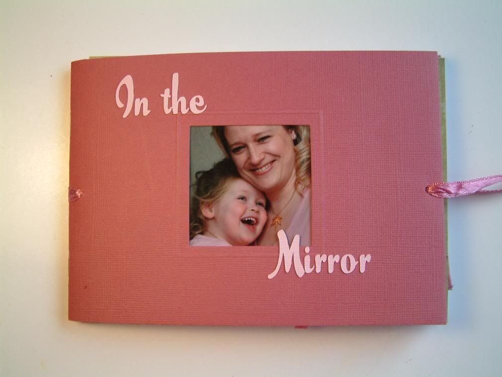
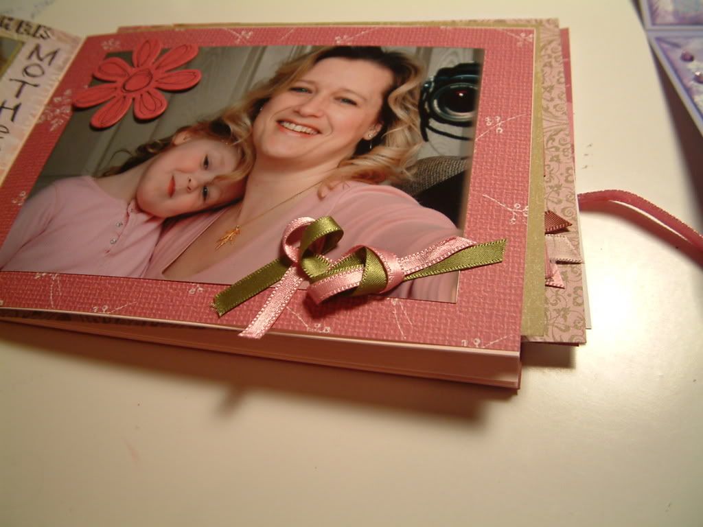
This is another DPS (double page spread) in my "in the Mirror" album which is 5x7".

It is mostly made up but needs something else... and that is some journaling or words of some sort.

I decided that rather than sit and try to complete the DPS and then move on to the next pages, I would make them all up as the whim took me. And so I have some pages half made with post it notes on them with ideas.

This LO just has a note of ideas for words I could use, others have a note of a particular embellishment I remember I have and would be suitable.

Basically, when you embark on a mini album, make it with the whole end result in mind (all the pages). Flit from one set of pages to the next and back again as the mood takes you, and if you get stuck, or bored with a particular set of pages, move on to something else and just leave yourself any notes for when you come back to them later. There is no point in struggling on till you have finished those pages, as you won't be giving your creativeness the freedom it needs to make great scrapbooks.

That is why doing a timed challenge can sometimes back fire on you if you force yourself to create something in time to submit it before a deadline. So if you take on a challenge, make sure you're fired up about it first... "let the juices flow..."!

Friday, January 25, 2008

Such a good boy!

This is not particularly about scrapbooking I realise, but I was so pleased with Inde today that I thought I would blog it!!

I was pleased because I walked all the way home with him through the housing estate WITHOUT his lead on! and he did exactly as he was told.

When he strayed a little bit ahead (ie just a few feet) I said "Heel" and he dropped back to my side! Waited when I told him when crossing the road, etc. Fantastic.

Admittedly there was only one man fiddling with (stop it!! LOL) his car, which Inde ignored, that could have distracted him, but I thought for a 5 month old pup, he was brilliant!! I'm a proud mum!


I took this picture about an hour ago with the Digital camera we bought our daughter! Mine is a bit bulky to take on a dog walk!

Thursday, January 24, 2008

Birthday Cards

I made a card for my 10 year niece last night, I used papers from Junkitz. Although the background is a photocopy of another of my daughter's "paintings".


The name is cut from the Junkitz papers, but then I realised I wanted to mount them up on foam pads, so I cut another set of letters out and adhered the paper to them to give them some strength, something I wouldn't have done before my Craft Robo arrived!
Inside is a bit more of the paper with 3 ribbons stapled to it. I always like to add something to the inside pages, it makes the card seem more special I feel.
The third picture here is the card Honey made for her cousin... bless her! Currently she has to write her name on everything including her age (4).


Wednesday, January 23, 2008

Sewing on Scrapbooking Layouts

This is my latest page. It was inspired by a layout by Marni Telford so this is my interpretation. The link to Marni takes you to the post including the photo of the Layout, but you have to scroll down to the third photo.

I did try to copy the photo here, but for some reason, 'gifs' don't want to copy!

Anyway I can't clearly see whether Marni has used stitching or just doodled, but I got the sewing machine out!! As for the title... "Badger" that was cut out using my Craft Robo, great machine!

The papers are mostly Basic Grey's Scarlet's letter 6x6 pad.

Oh and Badger... my old dog (although this picture was taken when he was a young man of around 1 year old!), sadly passed on Christmas Eve 2003 - 2 weeks after my daughter was born, he was 15. I named our last house after him, which is where I knew he would end up being buried... the house is called "Badgers Oak" and we planted an Oak tree sapling above him, don't know if it's still there mind! But there was a huge oak tree right beside the house anyway and more all around the fields surrounding the house. The new owners have kept the name and it is a little bit of my "little man" that lives on.

Badgers memorial stone (which we keep with us) just says...

Badger... My Shadow, My Friend.

Tuesday, January 22, 2008

Multiple photo Scrapbooking Layouts Sketch 68

This is a sketch from the Pencillines blog. It's number 68 and is by Sasha Farina in Singapore.
Posted here today as part of my new regime to to regular things on each day of the week.
Today... Tuesday... Multiphoto Layouts, sketches and completed work for you to gain inspiration from - I hope.! Well we've got to use up all those piles of photos right!
There are some examples of finished layouts using this sketch on the Pencillines link above.
This only has 3 photos, I thought I would ease you in gently!
I will be looking at various sketches, etc, and will start to post links to Layouts with 6-7 photos on!
Don't panic... it's not as hard as it sounds!

Monday, January 21, 2008

Mini Albums - Maze books

Right, I may be repeating myself a little here, because I mentioned maze books in the last post and gave you the link to the video as to how to make it from Scrapbook Lounge.

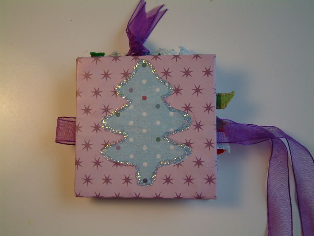
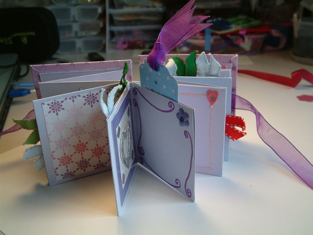
However, thought I would post a pic of the covers of my 2 maze books, as instructed by the video!

Here is a link to the ScrapBuddies' website where the group's maze books are posted.

Sunday, January 20, 2008

Watching Scrapbooking videos

I found an online craft tv website courtesy of one of my teammies on UKS. It was actually as we were in conversation about making a maze book. This link takes you to the “episode” about how to make a maze book, which is presented by Tricia Morris of The Scrapbook Lounge.

It is a high quality production and there is an archive you can look through to watch a number of video presentations. Now of course, they are promoting their own products, or rather what they are selling in their shop, but the videos are nevertheless very informative and easy to watch and I have recommended that my ScrapBuddies Crop ladies watch them.

We made maze books yesterday and I will post some pics (or a link to the pictures) tomorrow… as it is Monday and therefore “talk about albums day”!

For now this is my example maze book... he doesn't know it yet but it will be my hubby's valentine's day pressie!

Saturday, January 19, 2008

Scrapbooking LOTS of photos

Here is a link to an article from the scrapbooking.about.com website. There are 5 tips (from DCWV company apparently) showing 5 sketches and their corresponding finished layouts. The sketches are for for between 4 and 6 photos to a page.

It’s worth remembering why scrapbooking started… it was to record the contents of photographs and momentos… right? It is only recently that it appears to have taken on it’s own life as an “art form” and as beautiful as a single embellished photograph is on a page, it doesn’t get us very far down our stack of pictures, now does it!

So basically we need to "pack 'em in" and "use up" as many photos as possible and as quickly as possible if we are to make a dent in the pile (on our computers or sitting in bags and boxes).
So to that end I shall endeavour to bring you articles and sketches for multiple photo page layouts, so that we can get on and enjoy that feeling of having to take more photos to scrap... like that's ever going to happen! LOL!
The layout pictured is an 8x8 page and contains 5 pictures. A good way to save space for more photos on a page is to put the journaling behind the photos (hidden journaling) - in this case it is a tag which slides behind the main photograph.

Friday, January 18, 2008

Interactive Scrapbooking pages

Here is a link to an article about how to accommodate what I call "interactive" pages and what they call "lift the flap" pages, in an album with the usual page protectors. It's on the scrapbooking.about.com site.

Now, i'm not actually sure that I wan't to start cutting up my page protectors! But I suppose it's not so bad if the album in complete and you know the pages will not be changing order!

At the moment I have a number of Interactive layouts... I like tags and hidden journaling under flaps, or inside things. But at the moment, I just slip the whole page out to show people they "bits and pieces". But then I do constantly change my pages around as I take them as examples to my crop, so put the newest ones in first, etc. Now I do have more than one album, but you get my drift, I'm sure!

However, I still don't know if I would cut up my page protectors, even if I was giving the album as a gift, because I would still want to get the pages out to touch all the other "stuff" on the pages.

Yes, it can be a pain getting them in and out, but the fun of fiddling outways the slight inconvenience of that one pain in the neck brad that keeps catching as you slide your page in! LOL!

As you can see from the photographs here of a layout... this "pull out" line of photographs just wouldn't work through a hole in a page protector!

Still - it's an option worth thinking about if you like to keep things looking neat and tidy!

Thursday, January 17, 2008

Challenge - Scrap Yourself Scrapping!

I thought I would set up a challenge today, to run, say, till the end of January?!
It is to take a picture of yourself scrapbooking, and then make up a page with it and explain what our hobby (sharp intake of breath!) or should I say lifestyle, does for you. You will either need to enlist the help of someone or use a tripod. ! LOL

Here is a photo of a layout by Marni Telford in Australia from her blog "Note to self". I was looking through her blog recently and like her freestyle of scrapping.
It is particularly inspirational because it just shows that freedom and reminds me that I don't have to get caught up with fussing over stuff... a breath of fresh air.. and in that vain I shall "freely" scrap my interpretation of today's challenge!

Wednesday, January 16, 2008

Digital 12x12 scrapbooking layout

Following on from yesterday's post, this picture is of the background (made from photographing my daughter's painting) now made up into a 12x12 page.

The idea for the page was an In-Team challenge (from my UKS team) and that was to scrap a view from one of our windows.

It's funny though... I'm not that happy with it, but that is mainly because I am very slow at making the pages. As I do't do that many at the moment, remembering how to change the colour of elements to match the background paper, for instance, is a matter of going to some websites to refresh my memory! That takes time! So it's a bit "make do" and belies the actual work behind it!

Then I don't have the equivalent amount of digital stash as I do in "hard" stash (as in hard copy!). So I find it a bit frustrating as I know I could do it better by hand. Still I will only learn and become faster by practising right!

In case you can't read it fro the low res picture here, the journaling reads as follows:...

Here are two photographs which show a sort of before and after.The top picture shows the expansive view outside my craft/office window at my last house, and the bottom picture shows the view I have now.
The reason for the title of this page..?The house we live in now cost half the price of the last one!
Why did we move...?
Because we now have no mortgage and have the money to go on holidays, send Honey to a lovely nursery, go out for lunch, get takeaways...all those social things, which... for the moment, are more important than the our views!

Tuesday, January 15, 2008

Homemade Scrapbooking Background Papers

This Picture is a homemade 12x12" background paper I created this afternoon!

Actually it's been created from a photograph of one of my daughter's nursery painting exploits! At the moment she is into just covering the whole page with paint (in this case A3 size - which is brilliant).

And by cover I mean edge to edge cleaning (as they say)! The only bit that's still white is the mark where the bulldog clip held the paper to the easel! I'd hate to think what the clip looks like!

This particular paper is called "Stormy Twilight"... you like? Bit of a grunge feel I think!

Anyway I had to work out how to get the picture up to 12x12 and at the correct resolution for printing (300dpi), but I think I have cracked it.

The photo here is only 72dpi of course, for web purposes. HOWEVER.....

I am planning to design some of my own papers and embellishments for all you lovely people to share!

FOR FREE !

All I have to do now, is (a) design them and (b) work out how to upload them to a suitable free file sharer, so that you can all download them!

So WATCH THIS SPACE... as they say!

Monday, January 14, 2008

Albums - the Making of 5x7 Album "In the Mirror" - Part 1

The first in the series of photos from the "In the Mirror" Album, which is an album of photographs taking during a 10 minutes shoot of myself and my daughter in the mirror (strangely LOL!).

This cover isn't actually finished!

"Well why have you posted it on here then?" I hear you ask!

Well, for a reason!

"And what pray is that?" you ask further!

Well, I want to show you that we all do stuff that we end up changing because it doesn't work. Now strictly speaking I knew the small size of these letters wouldn't be big enough, but I just had to try them. The reason I was so impatient was because the title to the album was the first ever thing I cut with my brand new Craft ROBO !! Woo hoo!

I haven't quite got the hang of the fact that despite typing in the height of my letters to be 3cm, that's not what was cut out!

So a TIP: when choosing a font size by mm dimensions rather than point size, be aware that the measurement often includes quite a bit of white space top and bottom of the letters themselves!

So anyway, I plan to cut this title again shortly, only much larger! Then I will also add some other embellishments such as a flower(s), and, of course, I shall post a picture of it as soon as it is done!

I think I will make Mondays, my "Album" day. Thereby each Monday the blog post will be about either an album I am working on and/or inspiration for albums from other sources.

Sunday, January 13, 2008

A Maze Book from my Teammie!

In December my fellow UKS team members and I decided to make something for each other for Christmas.

So we decided to make one item each and send it to the next person on the list we made of those joining in.

I sent an altered book (as I have posted previously) and I received this lovely maze book from my teammate Sally.

As I said to her... being someone who crafts and teaches crafts, I think everyone around me thinks they're not good enough or something... the "coals to Newcastle" syndrome!

So it was particularly nice for me to receive something that someone had really made FOR me.

It seems a shame to put photos in it, but I will do so soon, as that's what it's for!

So thanks Sally, it's a lovely little mazebook!

I will be demonstrating how to make a maze book at my next crop on Saturday 19th January.

Saturday, January 12, 2008

Christmas "Thank You" Cards

I have just finished my daughter's thank you cards!

Although I have yet to write in them and she has yet to sign them!!

Hopefully doing that tomorrow, but it appears we are off to see another panto tomorrow lunchtime in Norwich, same price tickets as the last one (see previous post) but I am hoping that the production is going to be a LOT better! Unfortunately we are upstairs in the gallery, so no chance of a stage visit again! Will let you know how it was!

Anyway, list of items used on this digi card...

Frame and bow by Cinzia Loosemore
Swirl overlays by Lauren Bavin.

I printed this in the corner of an A4 sheet with the "Dear" and "from" on the opposite corner (and upside down) and folded it in half twice - does that make sense? LOL

Friday, January 11, 2008

In the Mirror 5x7 Album

I am in the process of making an album completely of a photo shoot I did with my daughter in the mirror, hence the title.

It is an album in progress at the moment, and I plan to trickle feed the pages as they are done. However, thought I might do a bit of "before and after", as I have roughly laid out the pages, but have yet to finish them, and it is always useful to see "the processes" that go on with the creation of these scrapbook pages.

Often you look at a page and say "Wow", forgetting that a page is an evolution. We sometimes look at layouts or albums and think that it was all "planned" like that, when in fact it quite often ended up that way accidentally!

How many times have you had to improvise an embellishment of some sort to cover up a mistak, eh?

So I will show you all the "nitty gritty" if I have made a mistake (which I do you know!! LOL) I'll show you what I did to improve the situation! Lots of TIPS for you!

Thursday, January 10, 2008

Magazine Photos to get you started

Sometimes new people to scrapbooking, want to have a go, but don't know what photos to use or don't have enough for a "mini album" at a workshop (for instance). Or as some do turn up for a workshop and either forget to bring or didn't realise they needed to bring along a handful of photos!


That's never a problem!

I usually have on my possession at a crop or workshop, a catalogue with the usual portraits of people showing off the wares of the company concerned. And some catalogues ( I have a number of children's ones come through whether I want them or not) are quite inventive with their photography - like group shots and landscapes visible.

Anyway, these photos can be cut out and used as a way to get beginners scrapbooking. It's worth taking another look at your catalogues and magazines, and gaining inspiration from their photographs, composition, etc. Because they are quite often NOT taking a picture of the person themselves, rather showing off a gadget, or clothes, etc. So you can get a different perspective on a subject.

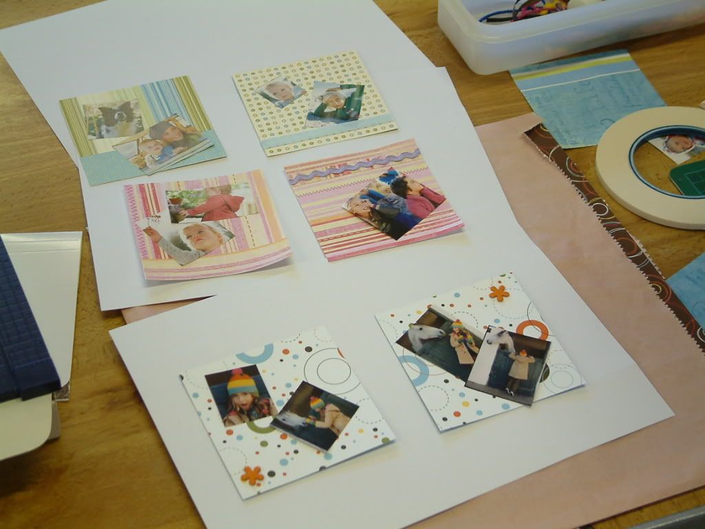
The picture here is of some photos one of my newcomers cut out from a children's clothes mag I had, so that she could work on making pages for a booklet during the workshop.

Wednesday, January 09, 2008

Hanging Concertina (accordian) gift book

Last month I gave you a taster of a hanging min album I had made for someone, but I couldn't upload pictures of it all because the recipient might come on an read the post!

So I promised I would publish the photos once the person (who is my step-mum) had opened her birthday present! So here they are!

Tuesday, January 08, 2008

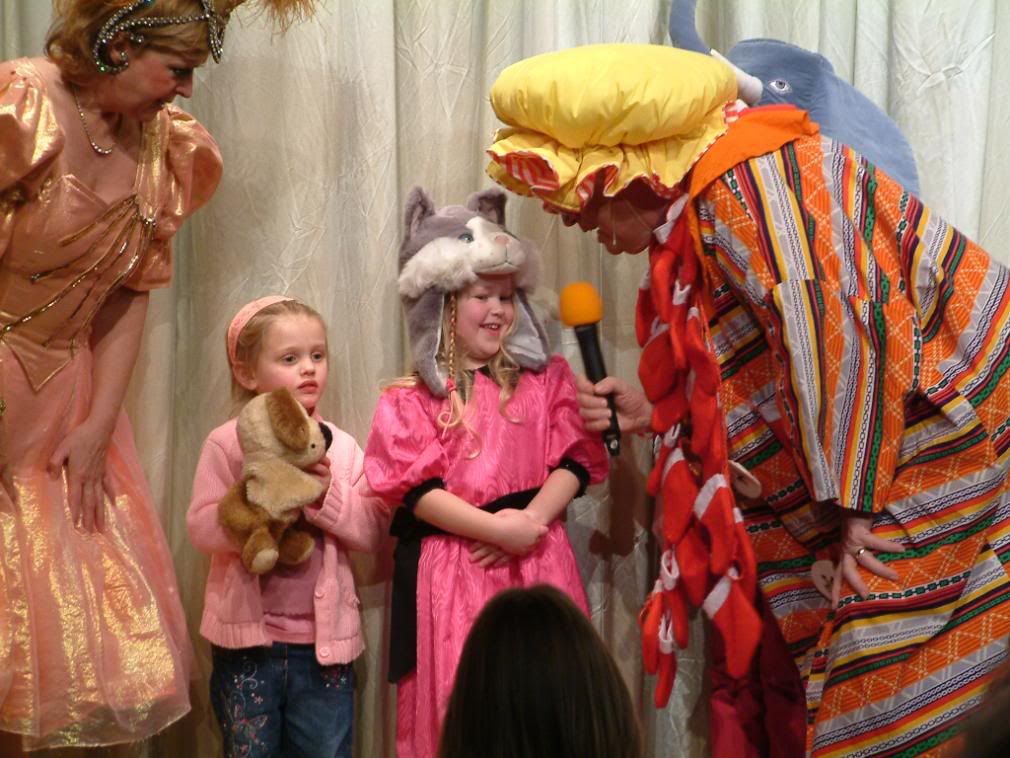
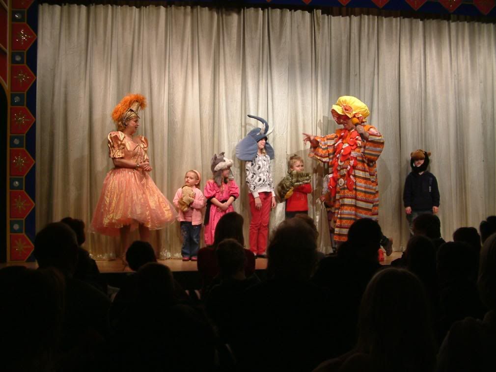
Christmas Panto - Good Grief!

Ok... my first "controversial" blog post...

We took our daughter to a local pantomime last Friday and I have to say that I was disappointed.

It had a local "celeb" who looked most uncomfortable - an older woman in a fairy dress! The "professional" cast were very amateur and the baddie looked like he should have been on the Shakespearean stage (he was the only one with natural presence as opposed to the garish costumes of the Dame).


The Dame him/herself was the only redeeming feature of this fairly expensive outing in a VERY small local theatre! The costumes (even the dame's could have been a bit more lavish) were appalling, the 3 bears' costumes looked like they had been retrieved from a basement somewhere and Daddy Bear was down right scary I thought!

The accompaniment was mostly recorded, and I'm sorry but "Flashdance" is not a suitable song for a Panto and neither is "If they could see me now" from Sweet Charity. The words of both were not changed to fit the occasion. And these and other songs went on far too long. You could see the kids getting bored and fidgeting!

I do have to thank Goldilocks for my sides hurting with laughter, although she would probably be dismayed to know that I was in hysterics during her rendition of Flashdance, mostly because her "dancing" (and I use that term very loosely) was embarrassingly bad. It only dawned on me towards the end of it that her abilities (or should I say lack of them) were for real!

But at one point I was laughing so much I could hardly breathe!!!!

Now I do have to confess that I was an amateur dramatic and operatic participant many years ago... but I was shocked and, sadly, appalled at what I saw and my society would have been ashamed of itself if it had produced such a performance.

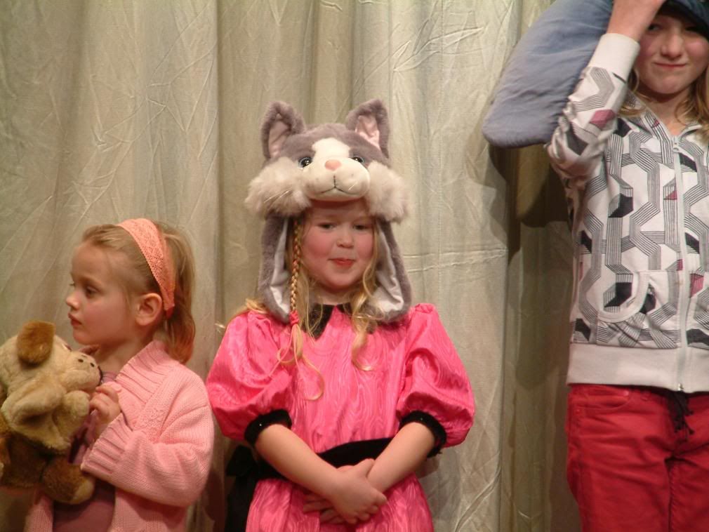
All that said... once Honey had got into the swing of things she enjoyed it. And, as you can see, she finally rushed up on stage (which I will admit would not have happened in a bigger theatre) to participate (which is all she thinks a stage is for..... HER!)

And I managed to (a) remember the camera and (b) take some good photos without using the flash! Good old Fuji 602Zoom - excellent camera!

Monday, January 07, 2008

New Layout - first for 2008

Ok so the last post was a little boring... picture of a handful of rocks!

Well it was about using the gloss actually, but I have now glossed something else and it's on a layout!

This is my first page of 2008 - it's an 8x8 page and done in an hour and that included getting my new Craft Robo (christmas present) to cut out 2 titles, the first being the wrong way round! tut! - well it was late!

I made it up as I went along, I think it looks a little like it too - but I was determined to make up a page after all that clearing up and clearing out!

Basic Grey papers, although they were actually scrap photocopies, I had taken copies for another layout, but the colour cartidge was on it's way out and the papers were a little on the yellow side... but matched this picture well, so I used them!
The gloss I was referring to, I added to the word Moody which I had cut using the Craft Robo ("Cream and Sugar" font). It gave the brown paper a little more "oomph", but I did have to trace an outline of white around the "y" as it got lost in the "grass" !LOL

Sunday, January 06, 2008

Wet, or Glossy?

These are some flat stones I collected by a stream running through my sister-in-law's farm just inside the Welsh border.

Of course, when I picked them up they were dark and shiny because they were wet with either water from the stream, or dew.

But they dried out and were the matt finish you can see in the picture. But asI collected I knew that I had a product at home that could possibly work as a varnish, thus giving the look of the stones being shiny and wet again.

Et voila! I used Anita's 3-D Clear Gloss Finish (for liquid embossing). I'm sure there is a straight gloss finish that would work equally well, but I am still rather pleased with the end result. I plan to use the

pebbles on a layout about a previous visit to this side of the family, and of course, you will be the first to see it!

Whilst I was at it, I decided to "gloss" a large maple leaf I had pressed from last year. Not sure I like the plasticky look to the leaf now, but I will be using it on a layout too, and I do like the way it brings out the veins... what do you think?

Saturday, January 05, 2008

Lessons in Life

I was taking a look at a blog - Scrapbooking one of course, actually by "ScrapDolly" and came across a lovely piece of video courtesy of YouTube. It is moving as ScrapDolly says herself. No I don't believe in God per se... but I do believe in the sentiment portrayed here!

The music and photography alone are worth watching! Watch with an open mind!


Clearing Out

Oh so much "stuff"... we all have it!

Now I don't mean stash, I mean clothes, paperwork, etc.

Today saw the beginning of a massive clear out. I had already reorganised my office/craft room and this afternoon have thrown out (or to be donated) loads of clothes that I never wear any more, or really shouldn't because they are so old.

It's time to chuck out the past and make way for new!!

Thursday, January 03, 2008

New Year... New Me!

Well I have come into 2008 with a bang! Full of enthusiasm for "out with the Old and in with the New" !!

If you are like me, (and I think it is a little bit of a prerequisite personality trait for a scrapbooker to be honest!) then you are a teensy bit of a hoarder... am I right?

Definitely for scrapbooking purposes do I keep things that I would normally have thrown, but then there are the clothes that I haven't worn for ages, and frankly forgotten I had because they are tucked behind some towels in the linen cupboard because there is little storage space in my house!

Christmas, or rather the aftermath, is one of the those times that tends to highlight how much we really do already have and just don't use, even though we thought it was a good idea at the time. I have to say that I have stopped buying clothes thinking to myself "I can take that bit in or I can shortened the legs!" I just don't buy it now unless it fits properly, because we never get around to it do we?!

Anyway... I have big plans for a massive clear out this weekend of my clothes and my daughters clothes and a few of her older toys, bearing in mind her birthday and christmas being within 2 weeks of each other means she has LOTS more!

But the biggest decision I have made, just today in fact, is to change my main business website over to Scrapbooking! That means creating a whole new website from scratch! which... yes... means a whole lot of extra work!

However, I plan to put up FREE TEMPLATES and FREE SKETCHES for both digital and traditional scrapbooking and useful information with links to other sites. I am currently in the process of designing a special little tool for scrapbookers to use to set their own challenges - (that's all the info I can give you on that one at the mo!)

I am also writing a SCRAPBOOKING FOR BEGINNERS ebook which will be available from there too.

So watch this space, as they say, as it will be here that I announce the new website's launch!

As for the photo... just thought a cheesy grin from my daughter might cheer a dreary winter's evening!

Tuesday, January 01, 2008

Scrapbooking to clear the post-Christmas and New Year blues

Welcome to 2008!

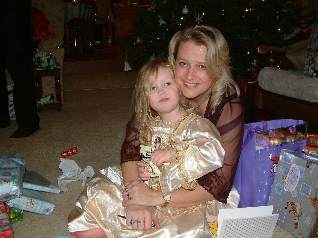
This is a photo of myself with my daughter opening her presents on Christmas Day afternoon. She opens whilst I write down from whom all the presents came... as long as I can keep up!
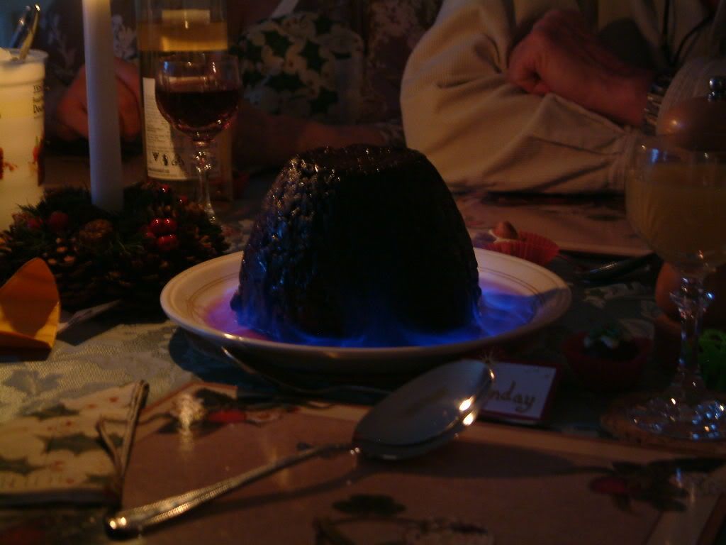
The other photograph is obviously of our Christmas Pudding, made by my sister (especially without orange peel or cherries - cos I don't like them - bless her - thanks Troy!!).
I particularly like the photo for it's serene properties. The quiet blue flame lapping around the base of the pudding. Almost looking as cool as dry ice and belying the heat of the flame.

Well basically, we are now into the "after or post-Christmas" marathon of winter wet, cold and dark! Dreary times... however, Since I have found scrapbooking (and I used to do this with other crafts too) the long nights inside mean that I have a darn good excuse for scrapbooking all those photos I have just taken, OR I can scrap some more summery, warm photos if feeling a little bored of the winter blues.

If you are digi scrapping, now is the time to get hold of your templates and "quickpages" or go buy a couple and really churn out those layouts... do a couple in the next week or so and get them off to the family either electronically or by "snail mail" to the technophobic members! LOL!